The Charlotte Hornets have had a lot of different jerseys in their 35 years of being an NBA franchise. From their first jerseys being instant classics to some of the worst in the league (and everything in between), the energy around the city has risen and fallen accordingly as the Hornets rotated jerseys.
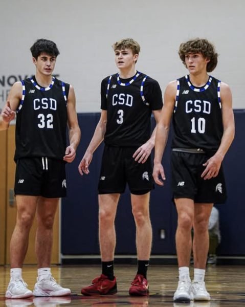
With the Community School of Davidson’s (CSD’s) men’s basketball team receiving new uniforms this season, it makes sense to compare and contrast jerseys, and how they impact a team and a fan base.
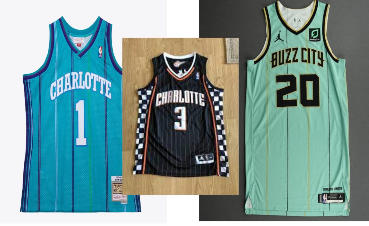
In 1988, as a new NBA team, the Charlotte Hornets unveiled their first jerseys which came as a surprise across the NBA. The uniforms featured pinstripes, Samsung the NBA I have not seen from other teams, and the teal, blue, purple and green mix gave a classy look to the new kids on the block.
The jerseys were an instant hit and the logo of a hornet bouncing a basketball became the fourth highest-selling logo in the NBA only behind historic franchises like the Chicago Bulls, Los Angeles Lakers and the Boston Celtics. The retro feel the Hornets jerseys had back in the late 80’s and early 90’s gave the jerseys a distinct aura that many jerseys strive for even to this day.
CSD women’s basketball coach, Matt Forrest, remembers not only the first edition of the team but also how much of a splash the uniforms made across the league.
“The classic 90’s jerseys are definitely my favorite ones out of the bunch,” Matt Forrest said. “It brings back memories of Larry Johnson and Muggsy Bogues back when the Hornets were a newer team and nothing gets better than those purple pinstripes,”
When the Hornets moved to New Orleans in 2002, it left the city of Charlotte with no basketball team for an entire year until the NBA decided to give basketball another chance in Charlotte with the introduction of the Charlotte Bobcats. Gone were the pinstripes and unique colors, plus all the energy, and in its place,was a poor replacement.
To put it nicely, the Charlotte Bobcats were not the best team in the association going 18 – 64 in their inaugural season and their uniforms, unfortunately different, too.. The reception the team received was bad but the jerseys for the Bobcats were abysmal with all the charm and classic feel to the Hornet’s jerseys missing. The Bobcat’s primary colors were navy blue and orange which simply did not mix well together making it very much a product of the time.
Thinking back to the original Bobcats’ uniforms brings unpleasant memories for some students.
“I think the concept of putting a checkered flag on the side of a jersey is a cool idea on paper but is not well executed in reality. Everything from the color to the pinstripes to the wordmark is not pleasant to look at which actually matches the team’s feeling,” Jack Parrot (‘25) said.
Over time, like their record, the Bobcats’ jerseys just kept getting worse. In 2009 they changed one of their primary colors from blue to grey. While orange and blue were bad, changing grey and orange were an even worse combination.
Then in 2012 the Bobcats reached an all time low with a record of 7 – 59, the worst in NBA history which might have been due in part to the ugly jerseys.
To spring some new life into the franchise the following year the team brought back the pinstripes which did not look good when the backdrop of the jersey was grey and the pinstripes were just a slightly different shade of grey. Adding a racing panel on the side of the jersey didn’t make it look any better.
Fast forward to today where the Hornets are now back in Charlotte and have gone back to their classic blue and purple colors. With Jordan brand taking over as manufacturer for the Hornets, the city has had a reemergence with jerseys with their teal blue jerseys making a splash combining the old with the new.
And the new jerseys have a modern sleek design that encapsulates what the city and the team are feeling now.
“I like the teal jersey color which is very distinct and is not seen in many jerseys in the NBA which makes them stand out,” Bryson Calkins (27) said.
The team has even added a “Buzz City” wordmark which is a cool phrase to call the city that is linked to the theme of Hornets. The catchphrase makes the jersey more interesting and the win/loss record plus the fan energy is on the upswing.
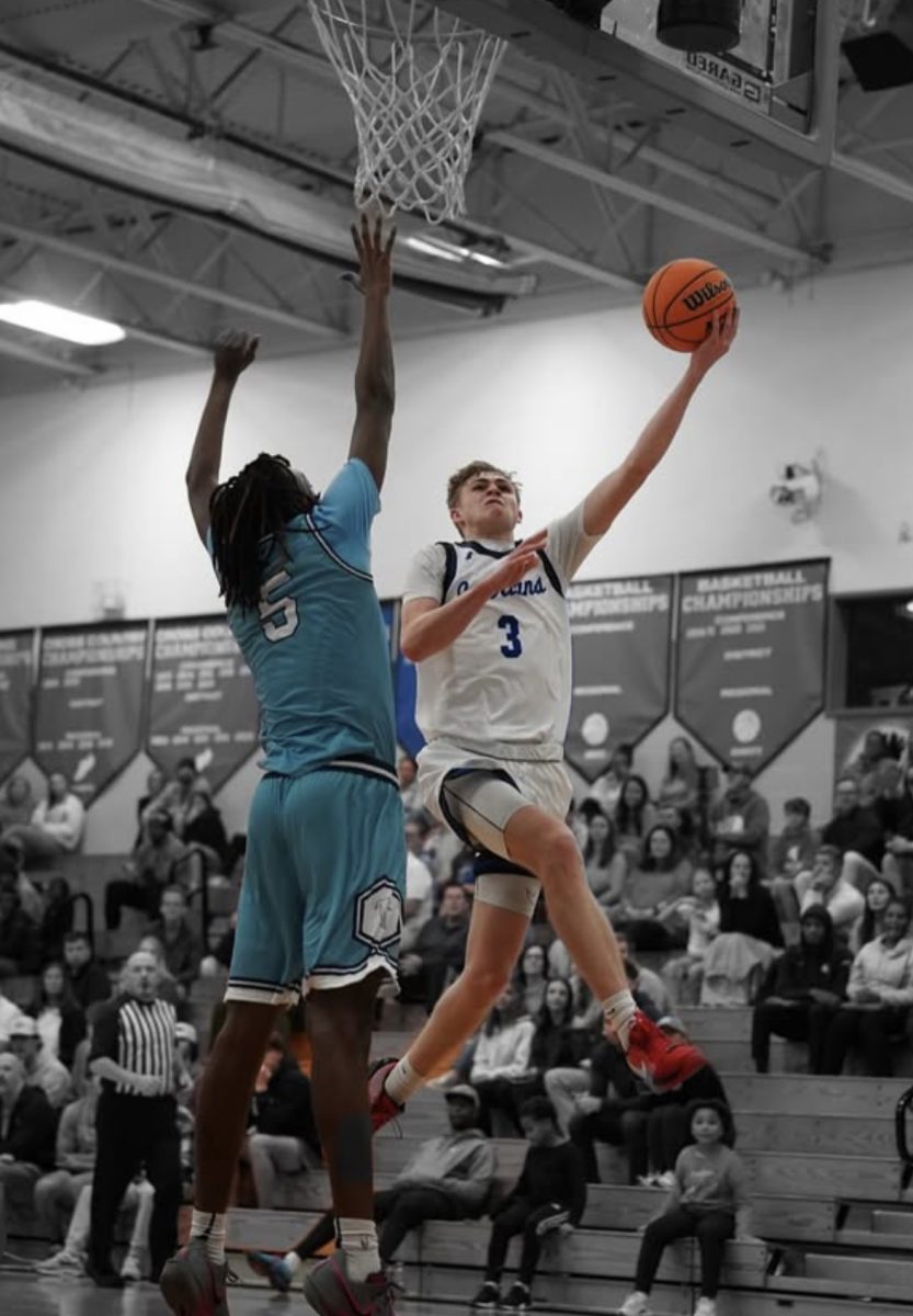
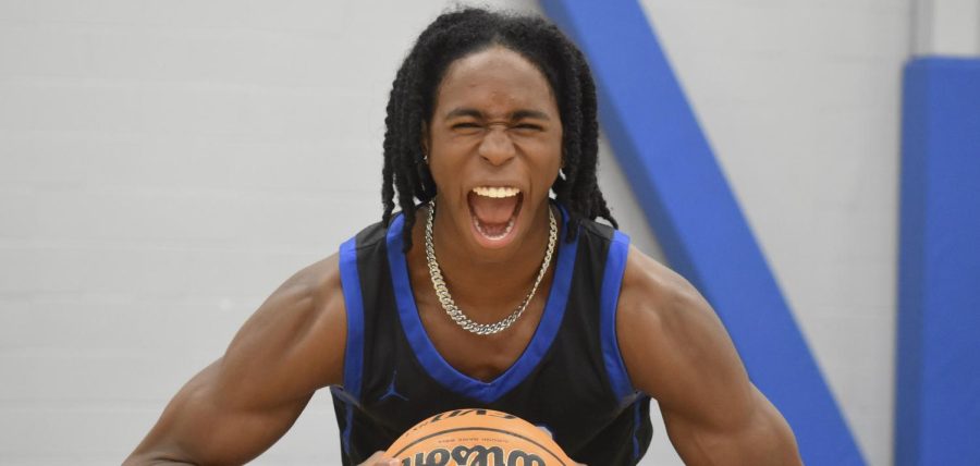
This season, the CSD boys basketball team received new jerseys, a sleek black with white and blue, and both players and fans are pumped about them.
Josiah Taylor (‘25) who is on the varsity basketball team, said, “I like the black jerseys which are new to CSD”
The Charlotte Hornets have had a complicated history throughout the years from changing cities twice and being one of the top jerseys in the league to one of the worst of all time and their records have reflected the ups and downs all along the way.
The one thing that has remained a constant is that the jerseys have always had a unique look to bring a certain opinion up no matter good or bad.
One thing is for sure, be it CSD or the Hornets, new jerseys not only make a team feel good but also energize a fan base, too.